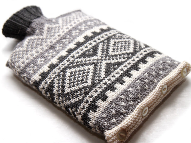
The evolution of the hot water bottle cover
Who’d have thought there was so much life in the humble hot water bottle cover! Not only has the Nordic Ski Sweater Hot Water Bottle Cover quickly become my best selling pattern, but the ones I knit for the shop are snapped up as soon as (and sometimes before) they’re off the needles.
This was my first pattern for the more inexpedience knitter and I’m really delighted it’s been so successful. I’ve also had great fun knitting the pattern in different colour combinations, and after reading Exploring Colour in Knitting I thought it would be interesting to share these.
My latest creation is my favourite so far! I think the neutral, low-contrast palette makes the traditional design feel really contemporary. This one is available to buy.
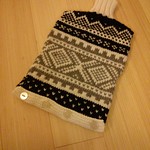
…in black, white and grey
This one was knitted for a gift, again a monochrome palette. This time I’ve used the lighter colour for the middle section, I don’t like it quite as much as the other way around.
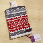
…in grey, red and white
I knitted this version for myself and also featured it in the pattern photography. Shortly after I made it I was commissioned to knit another in the same colours – clearly a popular combination! I still use the hot water bottle cover and love it.
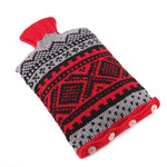
…in grey, red and black
This version was also knitted for the pattern photography. It strays completely from the traditional Nordic colour scheme, with the contrast colour being darker than the main colours. I wanted to encourage knitters to experiment and show the design with a completely different effect. The finished item was sold to a buyer online.

…in red, black and white
Another commission knit with colours faithful to tradition. At this point I was still developing the chart for the pattern. I made the central part of the design wider in the final pattern as it felt more balanced. This one was purchased by a friend.
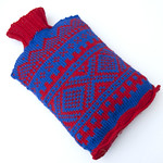
…in red and blue
I wasn’t lying when I said I liked bold colours. With this version I was experimenting with a two-coloured design, refining the chart and of course, seeing how the traditional motifs would fare with a radical colour scheme. I love the effect but I wasn’t sure whether anyone else would feel the same. I was over the moon when I friend asked if they could buy it. I offered to knit a new one in the colours of their choice but was re-assured “no, I like this one”.
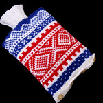
…in red, blue and white
I still have a lot of affection for the original colours inspired by traditional Marius sweaters. I expect that the next one I knit will refer back to this. This is the original proof of concept, knitted over Christmas 2011. I knitted a small swatch of the middle section but improvised the rest. The final chart is very similar to this first version. Most of the subsequent pattern development was the refinement of finishing elements – the button band, ‘shoulder’ seams and ‘collar’.
I have a feeling that first project was a commission – if so, I’m very grateful to the customer for effecting this creative journey.
I’m eagerly monitoring the Ravelry project page for the pattern to see what variations you come up with!
The original Marius®© motif was designed by Unn Søiland in Norway in 1953, and it is protected by copyright. Read about the Marius story at www.marius.no.
