There’s a new Stephen West shawl MKAL on the horizon! Several of you have asked us our shade recommendations for Starflake MKAL and we’re happy to oblige! We thoroughly enjoyed ‘The Doodler’ in 2015 but have not got our act together to take part in the last few, and I suspect that this year we’ll be enjoying it vicariously through your projects once again. The shawl is for a 4 ply /fingering weight yarn in two colours (two skeins of each). Here is Mr West’s guidance on the colour choices:
I designed this year’s shawl to feature two colors for a high contrast graphic design. I recommend choosing two colors that have a high contrast to see the crisp lines and details of the shawl. The shawl will be equally beautiful with a lower contrast if you prefer a softer, more subtle effect. Use solid, semi-solid, or lightly speckled yarns. I would avoid heavily speckled or variegated yarns for this design as they may obscure the design details.
Our deep purple ‘Dancing in the Dark’ has been a very popular option, so much so that it’s sold out (Edit: It’s back in stock!). We’re hoping to get a new batch done in the next week or so, but in the mean time we have a beautiful new dark blue shade – ‘Inky‘ – from our Watercolour Collection that would work very well. We’ve put together a few suggestions using this shade and some of our other favourites. At the time of writing we have stock of all of them.
Night and day
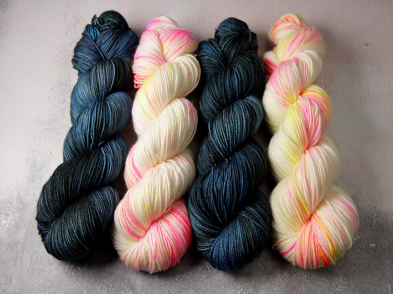
Favourite Sock pure merino 4 ply in ‘Inky‘ and ‘Sunset Beach‘ – this combination actually happened by accident when both colours landed on the twisting pile. It was too good not to capture!
Stand out
With ‘Inky‘ and ‘Health and Safety Gone Mad‘ there’s no danger of missing out on pattern definition!
Sea and rock
Neons not your thing? Try ‘Inky‘ and ‘Ore‘.
Purple sophistication
If you had your heart set on ‘Dancing in the Dark’, what about ‘Brixton Purple‘? It’s a cool toned dark purple designed to harmonise with ‘Dirty Lilac‘. This combo is more subtle, but should still give you the contrast you need to make the pattern work.
Harvest hues
‘Beachcombing ‘ and ‘Colonel Mustard ‘ are a warm yet earthy pair.
Colour contrast
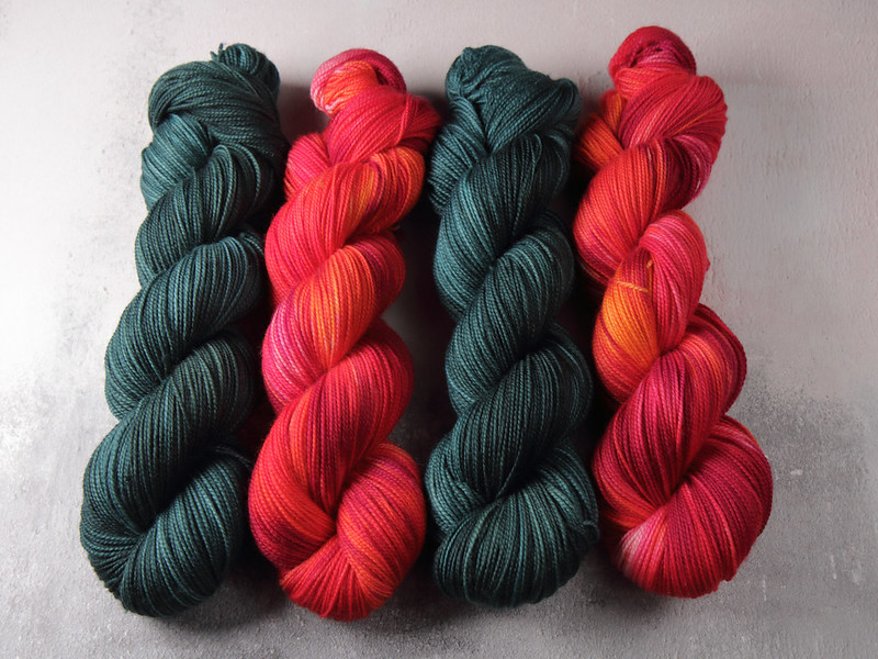
When we put these two on the photography table, there was a ‘WOW’ moment. These complimentary colours really make each other pop! ‘Spirulina‘ and ‘Momiji‘.
Alternative Autumn
Subvert the seasonal muted oranges and plums with the dazzling combo of ‘Professor Plum‘ and ‘Traffic Cone‘.
Rainbow bright
While the designer warns against variegated shades, there’s such a strong contrast between ‘Glow Sticks‘ and ‘Black, Like My Soul‘ that we think they’ll work beautifully.
We’re always happy to help if you’re having a colour quandary! And we can’t wait to see the combinations you come up with for the MKAL (which is the best part of the surprise for us). The Starflake MKAL kicks off on 4 October. Needles at the ready!


