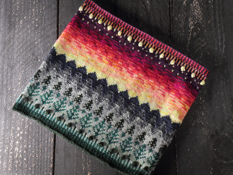
Our newest pattern, Tregrensa, is a celebration of colourwork traditions inspired by Scandinavian mountain landscapes.
This design represents many firsts for us. This is the first time we have created a pattern and a set of yarn specifically to accompany each other (in our 12 Days of Yarn-mas box). It’s our first figurative colourwork design, and the first time I, as a designer, have put quite so much of my soul into one pattern.
Incidentally, if you’re not yet a colourwork master, and you’re looking at this pattern thinking “whoa, that looks tricky”, let me reassure you that the yarn colours do much of the heavy lifting. Each stranded row is for two colours only, and the longest floats are seven stitches. If you have previously done any stranded colourwork, can knit in-the-round and follow charts, you can take this on and win.
If you’re a regular reader, it has probably not escaped your attention that I spend a lot of my holidays in Norway and Sweden. I am lucky enough to have close friends living in both countries, which has allowed me to see places others might not. This design isn’t a single place or moment, but an amalgamation of many treasured experiences.
Stranded colourwork has such strong associations with Northern Europe that it was the natural technique with which to capture the mountain landscape. This design pays homage to our favourite modern colourwork traditions, with our own contemporary twist of course.
Let’s start at the start.
On my first trip to Norway, I took the train from Oslo to Bergen in the middle of summer. The 6h journey took me from warm (actually 30°C in Oslo) sunshine, climbing 1200m to an inhospitable alpine plateau and back again, taking in fjords, waterfalls, glaciers, icy mountain lakes along the way. The ascent through lush green forests that gave way to sparse, ragged pines, then barren, snow-covered wilderness and rock is what inspired the lower part of the design, and also the name Tregrensa, which translates as ‘tree line’, the point in altitude above which trees cannot grow.

View from our cabin near Rjukan
A few years later, I joined friends in the mountains of Rjukan to celebrate new year. Aside for being famous for more interesting reasons, Rjukan is a ski destination. However, a 5-day blizzard left us mostly staring at outlines of straggly, dark pines from our cosy cabin. To me this was quite beautiful and exciting (less so for the skiers in the group), and imprinted the landscape in my mind.
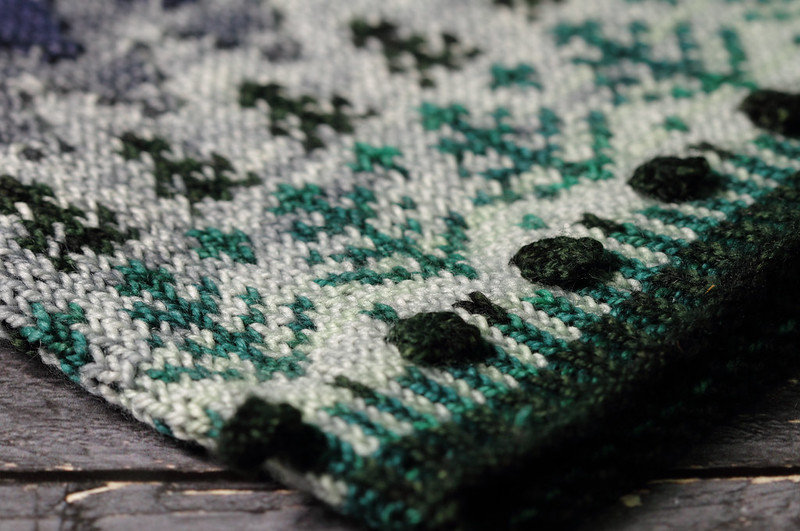
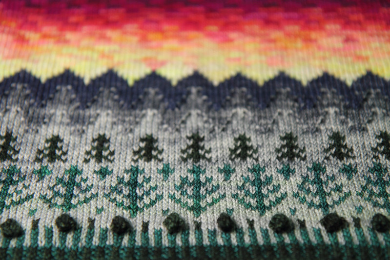
The lower edge of the cowl represents the verdant forest retreating to singular trees as we head towards the mountains. Pine trees translate effortlessly to colourwork, and this style of colourwork is reminiscent of the scenes often figuratively depicted on Norwegian mittens in two shades (Skeindeer’s Julenatt is a beautiful modern example).
The way the hovering mists hang on the mountains and slopes blur into one another was something I wanted to capture in this design, and leads us to another Scandinavian knitting tradition.
The Bohus style originated in Sweden in the mid 20th century and is recognisable for its intricate colourwork in many shades and clever blending effects. I particularly love the Bohus ‘Palm’ and ‘Mist’ designs, which are characterised by their use of purl stitches to soften colour transitions.
A few years ago I made myself a hat and gloves using the ‘Red Palm’ chart from the book ‘Knitting in the Bohus Tradition’. Although inspired by palm leaves, the abstract design had always reminded me of foggy mountains; the little purl stitches acting as the hovering mists on the mountainside, softening the jagged ridges.
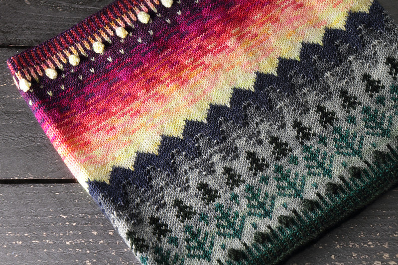
I used this purl technique to blur the boundaries between our layers of mountains, and add a little texture to the rocky peaks.
As we climb towards the summit, our mountains take on a bluish tone. This is characteristic of the fjordlands in summer, where bands of mountains appear as blue silhouettes against a sky that looks like it’s on fire.

Sunlight from a firey sunset hitting the steep valley sides at Trodla-Tysdal, a remote farm and camping area in Rogaland, Norway
We used washes of neon tones in our yarn set to convey the intense light on the horizon, the sun disappearing behind the mountains and lighting up the sky with a fiery glow.
The colourwork tradition I referenced for this part of the design is barely a ‘tradition’ yet. Fade/gradient knitting has taken the knit world by storm in recent years, but it doesn’t show up often in stranded colourwork. Although traditional Fair Isle designs often have short gradient bands worked over a small number of rows, the earliest example of an extended colourwork fade that comes to mind is the Dither socks by General Hogbuffer, published 2011. These snazzy socks use GIF style halftone patterns to transition between colours.
Tregrensa’s sky uses little bars, reminiscent of wispy clouds, to transition between the six shades of our skyscape, taking us into starlit nighttime.
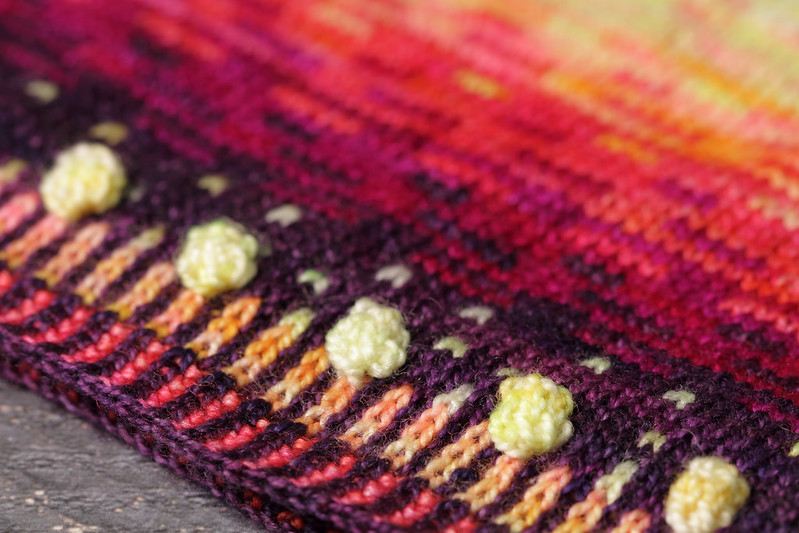
The edges of our cowl feature corrugated rib – a simple technique for a non-rolling edge, with the knits and purls worked in different colours. We’re not sure of the origins of corrugated rib, but it can be spotted on Fair Isle sweaters of the 1920s, including the one sported by the then Prince of Wales, which propelled Fair Isle knitwear into fashion.

Prince of Wales By John St Helier Lander, painting, 1925, Public Domain. The painting shows the Prince of Wales in a Fair Isle sweater with corrugated rib edging.
The bobbles? They’re our own contemporary addition.
I hope you’ve enjoyed this journey through our creative process.
The Tregrensa PDF pattern is available now for $6 from our website and Ravelry.
We have teamed up with three amazing UK dyers – RiverKnits, Felt Fusion and Hooking Marvellous – to offer yarn and pattern kits for Tregrensa in support of Australian wildfire relief. You can find details on the Tregrensa pattern page.
