A look back at the shades from our mystery yarn club, inspired by the quirks of the natural world
I think 2023 was a great year for Nature Lovers Club (our monthly yarn club) with lots of variety, lots of surprises and shades that really captured their inspiration. At the start of the year I always wonder how I will come up with twelve original themes, but as the seasons change, the ideas just keep coming!
January – Dusk Reflection
We had some beautiful sunsets last winter. These are not colours I normally associate with winter weather, so perhaps we had some unusual conditions? I particularly like the effect of dark silhouettes against these lovely plum and violet tones, and the golden yellow of the setting sun of course. It is something of a challenge to use purple and gold together and not end up with a muddy mess, but the ‘watercolour’ techniques I am fond of created a lovely effect that really captured the mood.
February – Niwl
‘Niwl’ is the Cornish word for fog or mist, and this shade is inspired by a particularly Cornish phenomenon: a dense fog that often clings to the coastline, even in the height of summer when just a mile inland there is bright sunshine. It leads to scenes like the beach photo below (captured at Porthminster beach, St Ives in summer) with it being warm enough to paddle but too foggy to see the other end of the beach. It has an unearthly quality that dampens both the sounds and the colours of the windswept coast.
I created this shade using airbrush techniques layering a number of different colours. I am still new to this equipment and using it to dye yarn is completely undocumented so it is a slow and experimental process. However, I am excited about the possibilities it opens up and the effect definitely lent itself well to this subject.
March – Burgeoning Buds
We had a long, grey winter here in London, but the tiniest pop of pink was just starting to emerge from the greyish stems of the blossom trees. We have an array of beautiful cherry and peach trees locally. This muted shade reflects the sparser, naked forms of the branches just before the flowers appear.
April – Dazzling Plumage
April’s shade was inspired by the Indigo Bunting, a little bird native to North America. Although a few creatures sport dazzling blue colours, it’s not something that appears much in British birdlife. I would be pretty excited if I saw this little fellow landing on the bird feeder! I particularly like the natural colour gradient of the plumage from the head down. This was a lovely shade to dye, and we still have a few skeins available.
May – Pelargonium
Pelargoniums are one of the most vibrant flowers of the British garden, with colours that reflect lots of UV to attract our pollinating insect friends. Every spring when they emerge I am compelled to reach for the neon dyes. Although we already have a stock shade inspired by this subject – ‘Geranium‘ (as they’re often misknown) – with such a variety of shades of flower in this species, there’s plenty of room for another!
June – Lava Pop
The glow of searing heat against steely black volcanic rock is a sight that has both terrified and fascinated us since the dawn of humanity. My interpretation uses a little bit of neon to evoke the intensity of temperature, capable of destroying and reforming entire landscapes in a moment. We have a few skeins Available here.
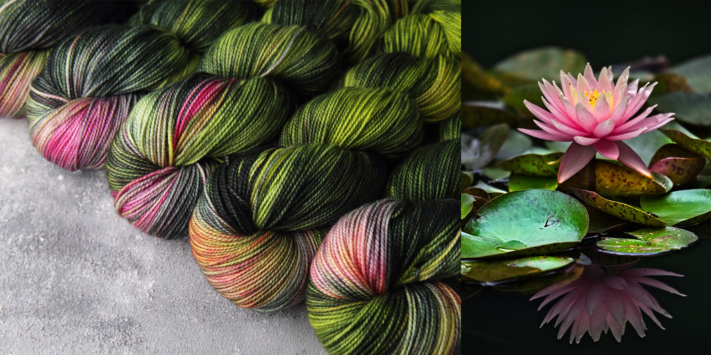
July – Pond Life
We made a little pond in our garden which has become a holiday park for the local amphibian population (build it and they will come!). I love the way the sunlight catches the water irises, creating bold contrasts of light and shadow on the surface. Occasionally, we are also rewarded with a lily flower.
August – Fallen Petals
This shade celebrates the beauty of things often considered past their best; faded but not dull, with an appeal that’s not flashy and takes time to appreciate.
I often deliberately leave flowers on display after they’ve begun to dry, the colours can be so pretty I don’t have the heart to throw them away. I found the little dried rose below in my daughter’s room and I had to take the inspiration straight to the studio! We have a few skeins available here.
September – Autumn Bloom
This ‘bloom’ is not a flower, but the powdery-looking coating that appears on grapes. It was once thought to be the source of natural yeast that causes fermentation, but it is in fact a protective coating made by the plant. It adds such interesting, muted tones to the ripening fruit.
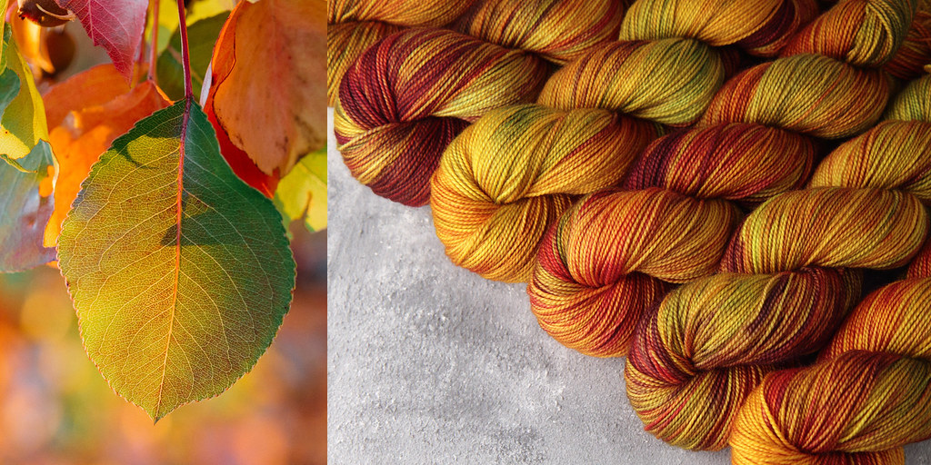
October – Crackle Underfoot
This shade was devoted to the jewel-like colours of autumn and the crunch of dried leaves on the ground. Judging by the popularity of this one, I’m not alone in getting excited about the changing leaves. If you’re interested in the creative process, check out our reel “from inspiration to skein”.
This colour would be fantastic used in a stranded design, as an accent with black or dark brown, even to represent leaves in a very lateral way in a design such as the Oak Sweater by Natalia Moreva. It also looks great with dark teal as a contrast.
November – Rainstorm
Foreboding storms were a theme for us in autumn, and made for some very dramatic skies. ‘Rainstorm’ is a versatile colour that would make a lovely pair of socks or a fine cabled hat in which to brave the cold weather. It looks great with neon yellows and oranges, and also works well with previous month’s shades ‘Crackle Underfoot’ and ‘Fallen Petals’.
December – Tangerine
I planned to something earthy and subtle this month, but had a complete change of heart on my way to the studio that frosty morning when fluffy white flakes started floating in the air. I decided that what we really needed was something zingy and bright. This colour looks great with cool greys, black and dark turquoise. I love it so much I decided to add it as a repeatable shade, and it’s now available in , DK and Lace weight. I am desperate to cast on a sweater in this shade!
If you like what you see here, Nature Lovers Club is currently open to new members within the UK. You can choose from 1 or 2 skeins a month, and from a rolling or fixed-time subscription. Members also now get a free shipping option on shop orders!
I don’t know that I could even choose a favourite from the last 12 months… obviously ‘Tangerine’ is up there, but I’m also very fond of ‘Fallen Petals‘ and ‘Dazzling Plumage‘. Which is your favourite?


So lovely to see them all in review like this
Thank you!